Get Market Insights for Business Growth
Providing Real-time industry benchmarks. Designed for clarity. Built for speed.
Powered By
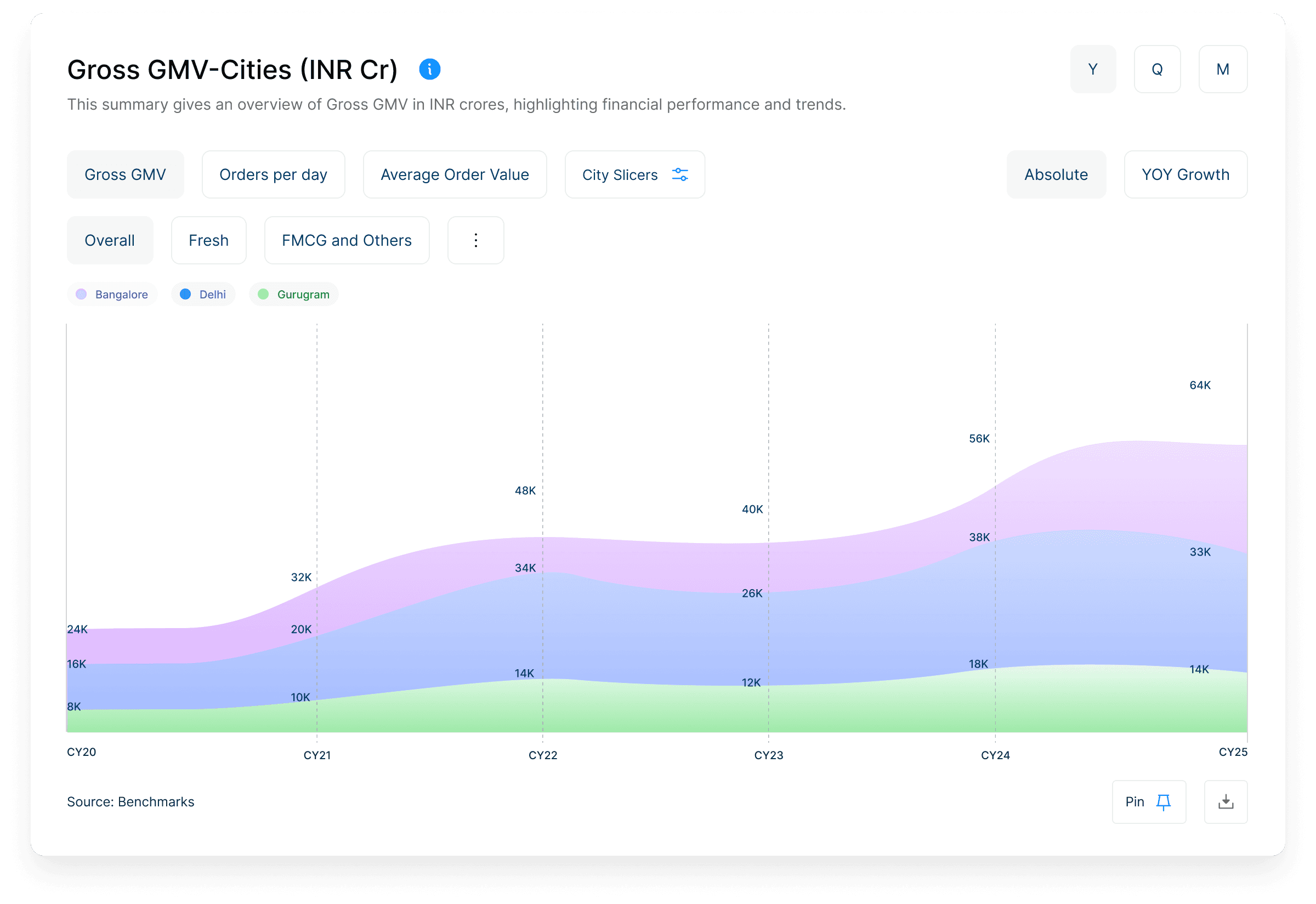
Benchmarks.Digital is a real-time intelligence platform tracking 100+ Indian internet companies. It helps teams compare key metrics like MTU, conversion, and retention in one clean dashboard.
Problem
Founders, operators, and analysts often struggle to understand how their business performs compared to peers. Real-time benchmarking data is scattered, outdated, or hard to interpret.
Contributions
Led UX research, UI design, and component system
Built interface systems
Designed Conversational AI assistant
Created design system in Figma
Delivered dev-ready specs & led weekly design reviews

Goal
How might we help users instantly compare metrics to industry benchmarks without friction?
For Benchmarks, We followed a layered UX approach inspired by Jesse James Garrett’s "Elements of User Experience".
UX Process
This framework helped me ensure every design decision to align with real user needs and product goals.
Surface
Visual Design
Look & Feel
Hi-fi Mockups
Prototypes
Skeleton
Interface Design
Navigation Design
Lo-fi mockups
Wireframes
Structure
Interaction Design
Information Architecture
Site Maps
Flow Charts
Scope
Functional Requirements
Benchmarking
Gaps & Opportunities
Strategy
User Needs
Business Objectives
User Interviews
Interview Synthesis

Strategy & Scope
Finding Focus with Strategy and Research, with a goal to learn & empathize with users, not to assume
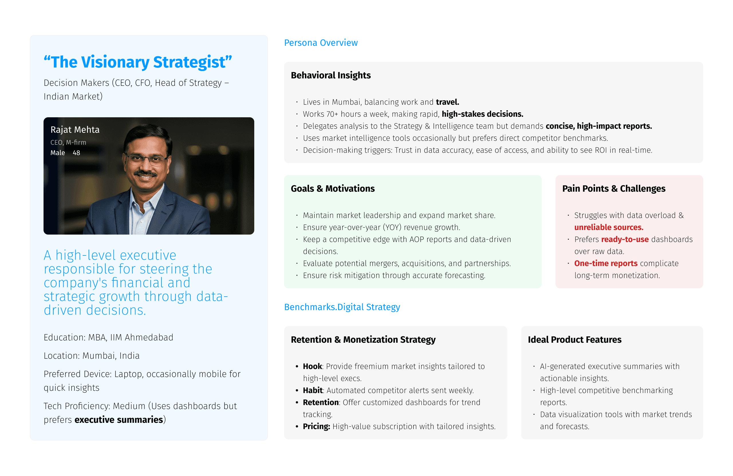
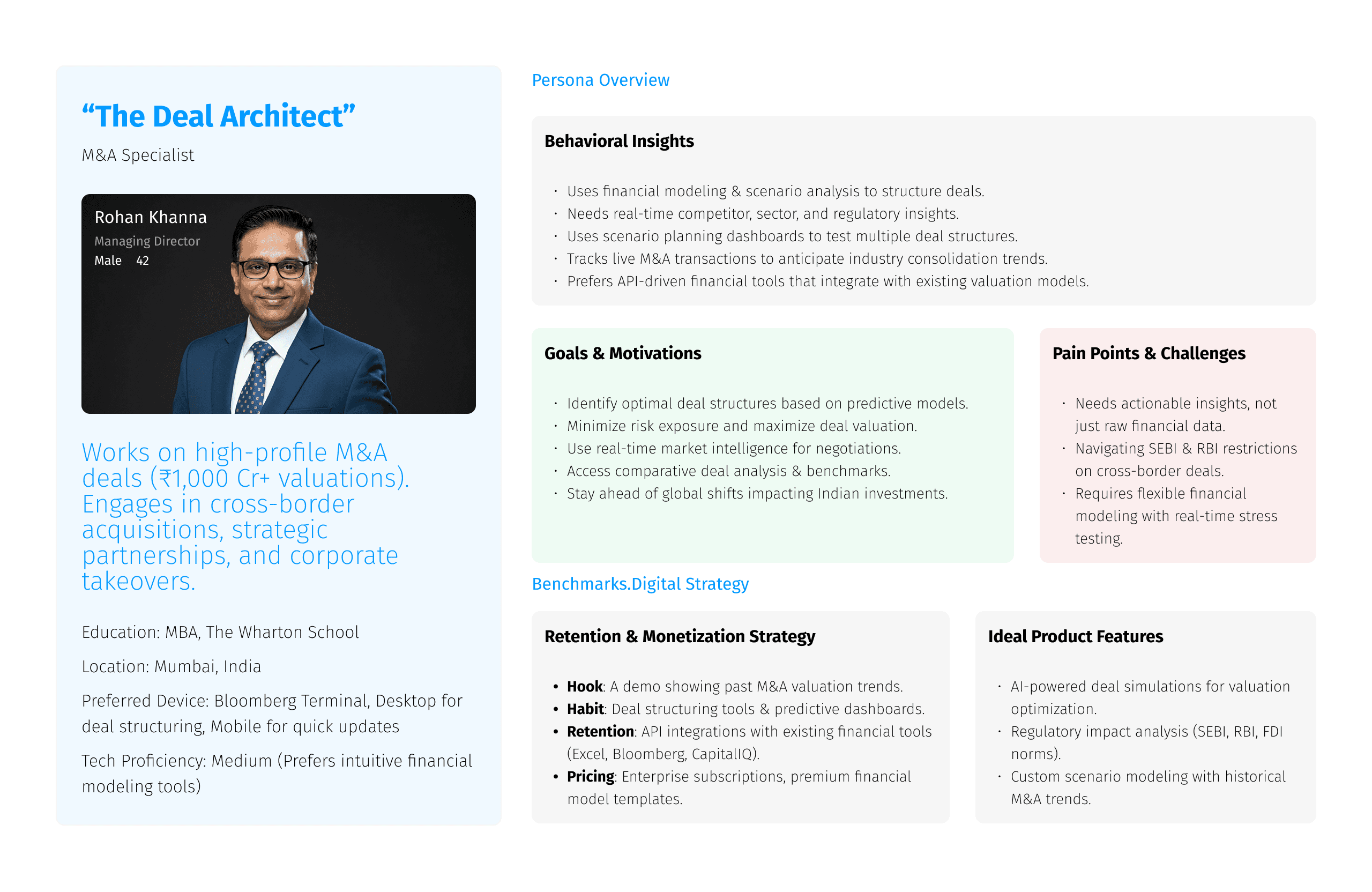
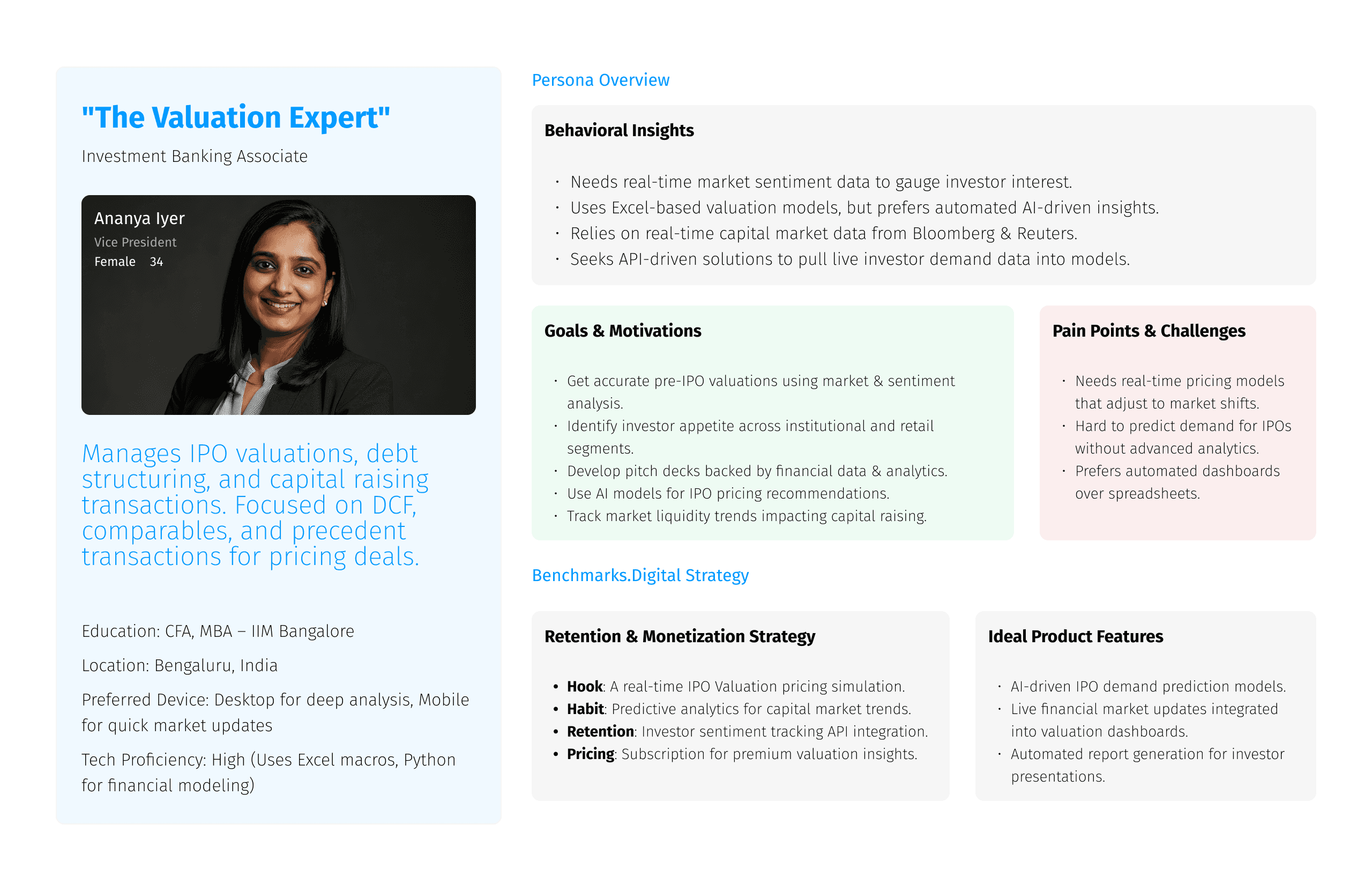
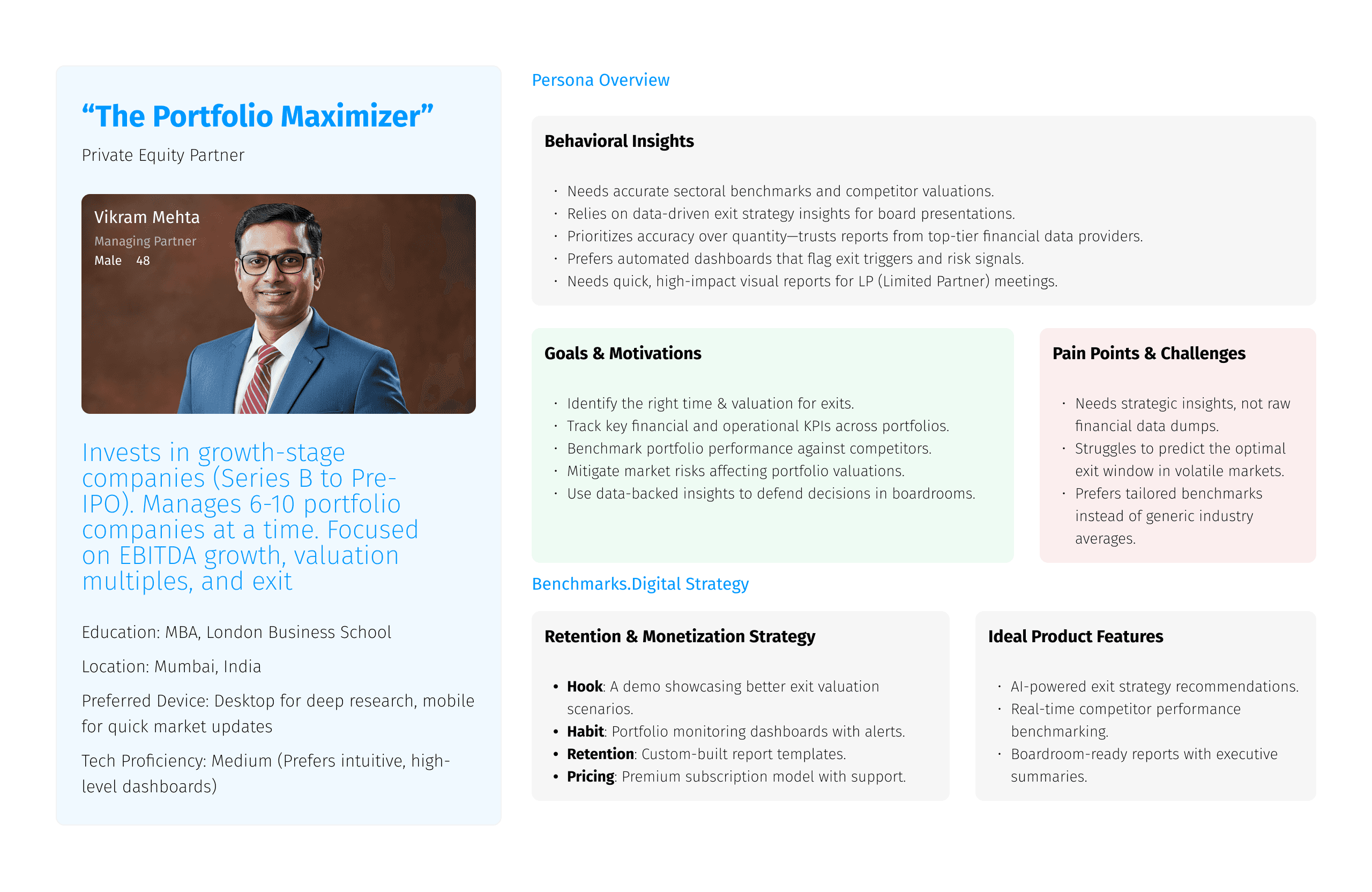
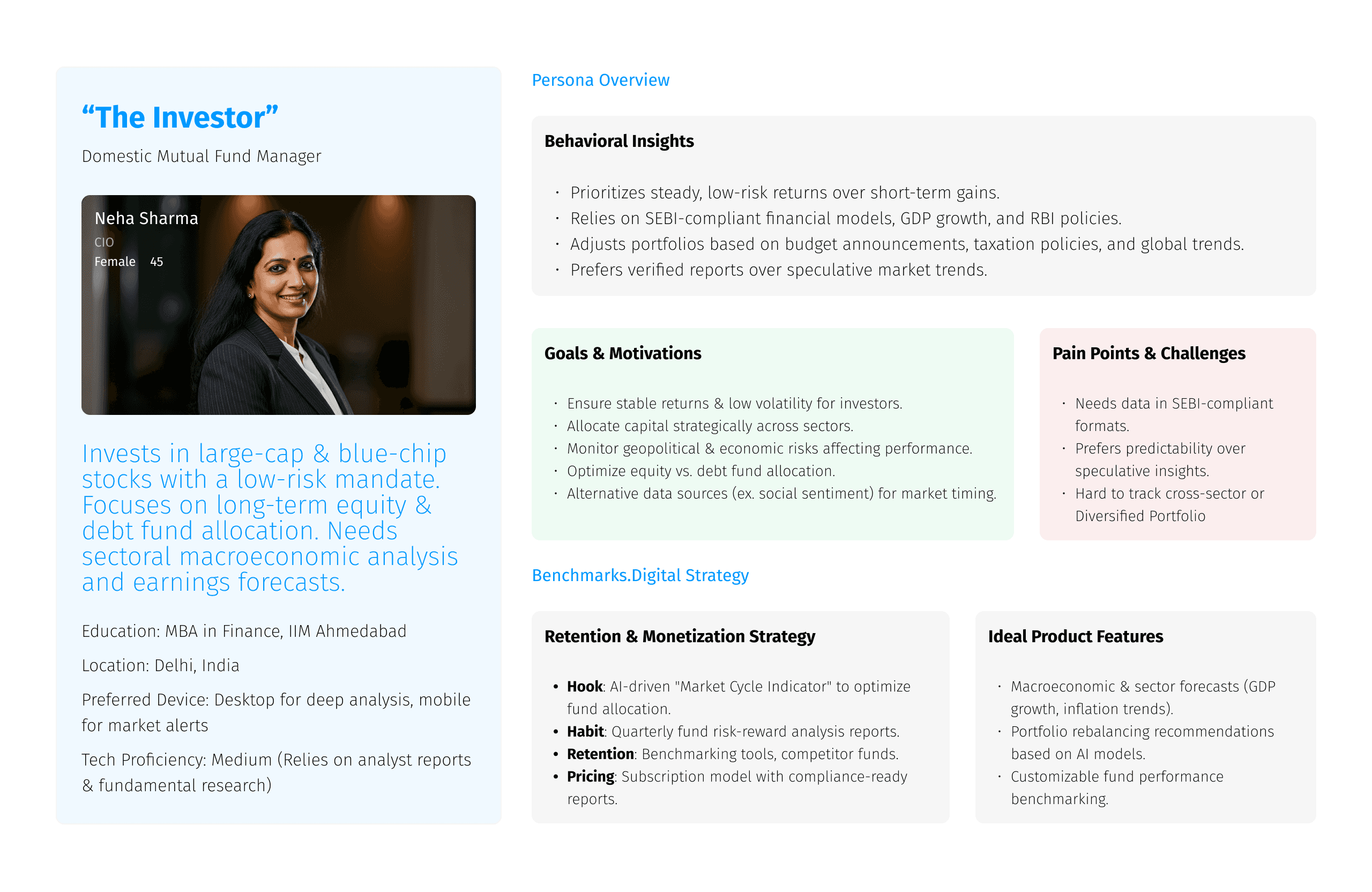
User Personas
We started with our desk research & created user personas to understand user needs and set our assumptions.


User Interviews
Next, we decided to conduct 1:1 interviews with stakeholders & clients to validate our assumptions & empathize

Analysis
Following are the insights gathered from our interviews and interactions with product users, Analysts & key market players.


Improving Scannability
“Now it's much easier for me to access, track and monitor certain market patterns”
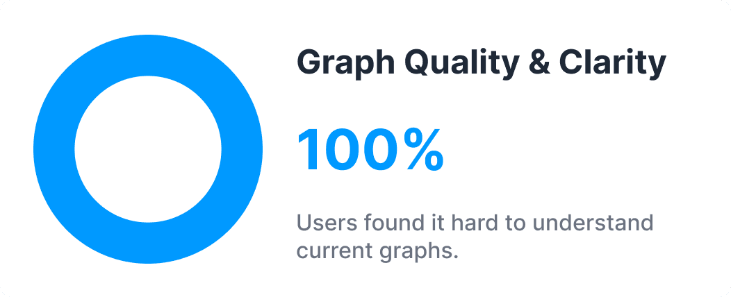
Problem
The original interface used dense text and static charts, forcing users to scroll and interpret, slowing down insight discovery.
Solution
Introduced a card-based layout that surfaces key KPIs (like GMV, MTU, AOV, Frequency) each paired with color-coded signals.
Time to Insight
↓ 35%
Scannability
↑ 60%
Engagement
↑ 40%
Cognitive Load
↓ 30%

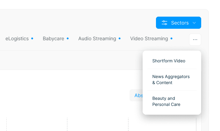
Rethinking Navigation
“The new layout feels like something I already know. It just works”
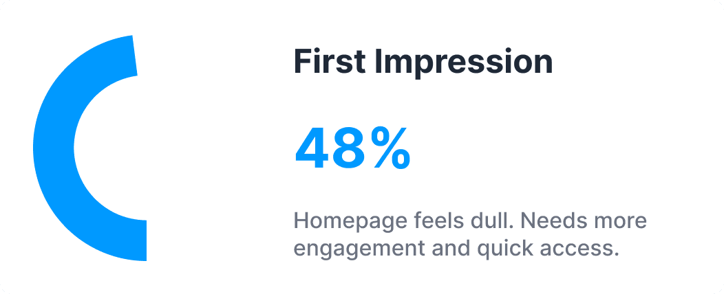
Problem
The original navigation relied on nested dropdowns and breadcrumbs, creating friction for users who navigated daily.
Solution
Redesigned the navigation experience by taking inspiration from Microsoft Teams, a tool our users were already deeply familiar with.
Avg. Clicks
↓ 52%
Avg. Time
↓ 49%
Familiarity
↑ 45%
Key Feature
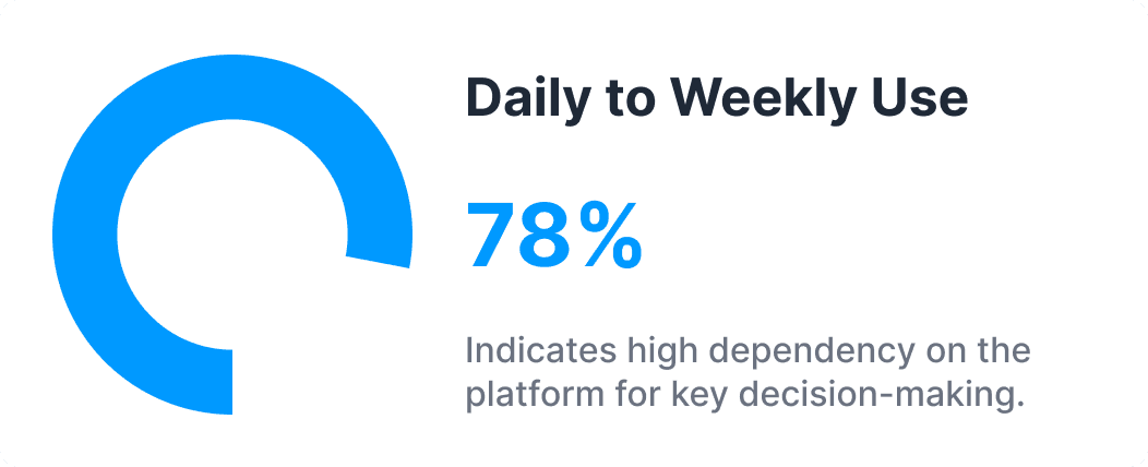
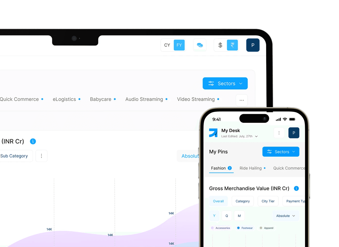
Introducing “My Desk”
A Personalized Metric board
Apply custom setting to your metric tables, including deletion (retain within 14 days)

Pin Metrics from various sectors, platforms or custom generated

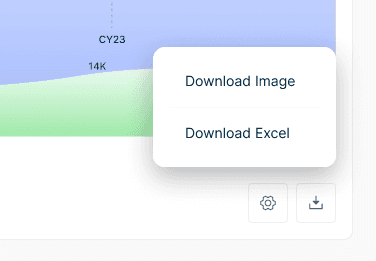
Download metrics as an image or excel sheet format
Smart handling for overflow items, if users go on a pinning rampage
Repeat navigation
↓ 60%
Adoption
↑ 42%
Familiarity
↑ 45%
Retention*
↑ 15%
“It’s like my daily dashboard now.”
Problem
Users often track 4–5 key metrics across different sectors, but had no way to revisit them easily. Every session meant re-navigating and re-filtering.
Solution
Introduced “My Desk” a customizable space where users can pin their most-used metrics, sectors, or charts. It acts as a personalized command center.

Benchmarks.AI
UX - UI
SaaS
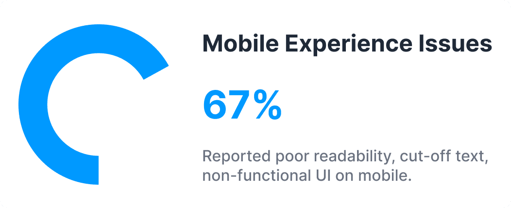
Mobile Version Coming Soon!
Please open this page on your Laptop or Desktop